CaloriMe Mobile App
An AI-powered calorie tracking app designed to support healthy habits through gamification and community-driven motivation.
Project Overview
THE PROBLEM
- Most fitness apps overwhelm users with complex data or fail to engage them with boring interfaces
- Barcode scanners often fall short due to incomplete food databases
- Manual entry is time-consuming and discouraging
- Users struggle to stay consistent and motivated in their tracking habits
THE SOLUTION
- AI-powered scanner that identifies meals and calculates macros instantly
- Gamification through consistency rewards and challenges
- Community support for accountability and motivation
- Clean, engaging interface that balances simplicity with depth
USER GOALS
- Log meals quickly and accurately without tedious manual entry
- Stay consistent and motivated in food tracking
- View progress trends and analytics over time
- Connect with a supportive community for accountability
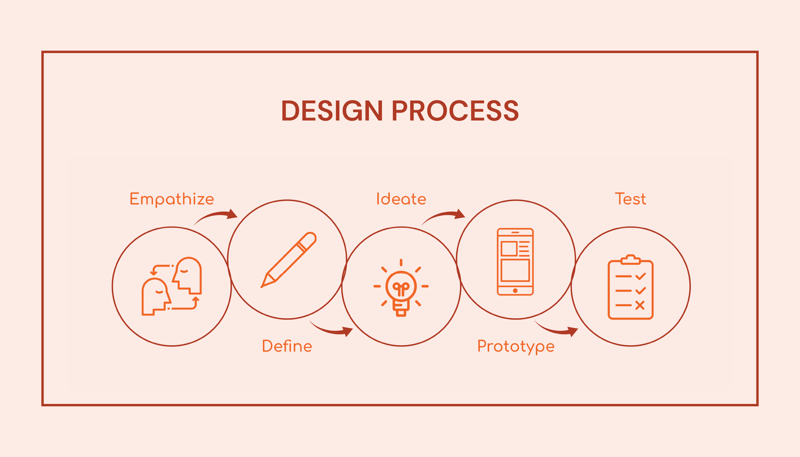
Phase 1: Research & Discovery
Competitive Analysis
I conducted a comprehensive competitive analysis examining fitness and nutrition apps within the same market sector. This research revealed critical gaps in the market and opportunities for differentiation.
Direct Competitors
MyFitnessPal
Strengths:
- Extensive food database
- Integration with multiple fitness platforms
Weaknesses:
- Previously free features now paywalled
- Overwhelming UI with too many features
- Incomplete barcode database
Cronometer
Strengths:
- Emphasis on data accuracy
- Detailed micronutrient tracking
- Curated, verified food database
Weaknesses:
- Less intuitive interface
- Many features require premium subscription
- Constant distracting advertisements
Lifesum
Strengths:
- Visually appealing interface
- Focus on holistic health including mental well-being
Weaknesses:
- Limited free features
- Lacks advanced customization for micronutrient tracking
Indirect Competitors
Habitica
Strengths:
- Unique gamification approach
- Strong community support fosters accountability
Weaknesses:
- Not specifically designed for fitness or nutrition
- RPG-style system can be overwhelming for users wanting simple tracking
Fitbit
Strengths:
- Automatic exercise detection
- Strong community features
Weaknesses:
- Calorie burn estimations not always accurate
- Inconsistent integration with other apps
KEY FINDINGS
Most competitors lock essential features behind paywalls, and while some prioritize design or data accuracy, few successfully balance both usability and reliability. Social and motivational features boost engagement, though some lack built-in tracking tools. These findings reveal a gap in the market for an app that offers accurate, intuitive tracking paired with engaging, gamified nutrition features.
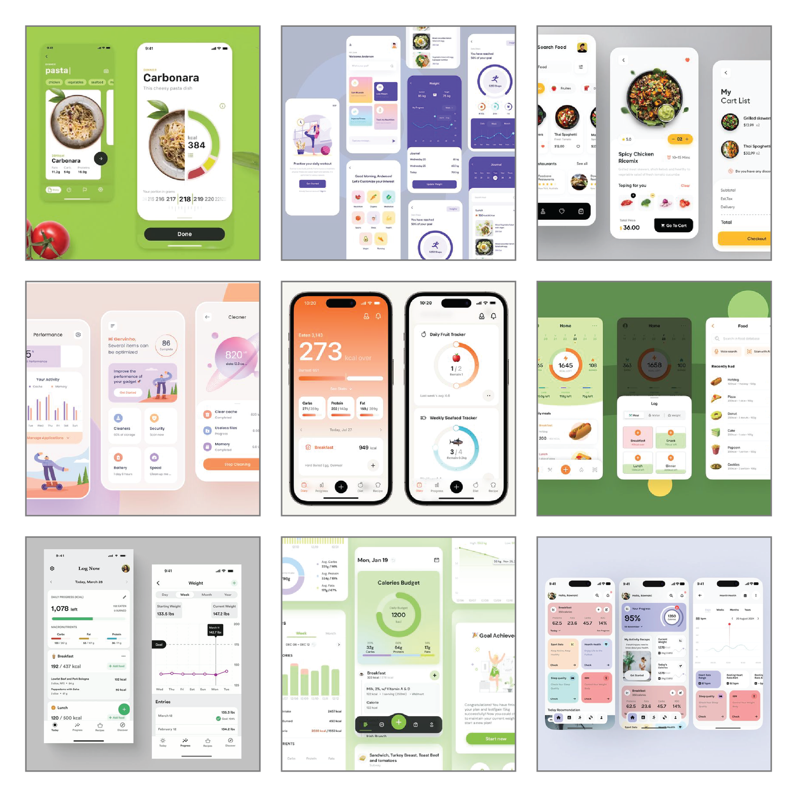
Visual Research
To guide the visual direction of CaloriMe, I conducted visual research by exploring apps with clean, intuitive interfaces that still felt engaging and dynamic. I focused on products that balanced simplicity with personality—prioritizing ease of navigation, playful visual elements, and well-structured layouts. I also took note of how similar apps presented features like food logging, progress tracking, and community interaction, using these references to inform and refine my own design approach.
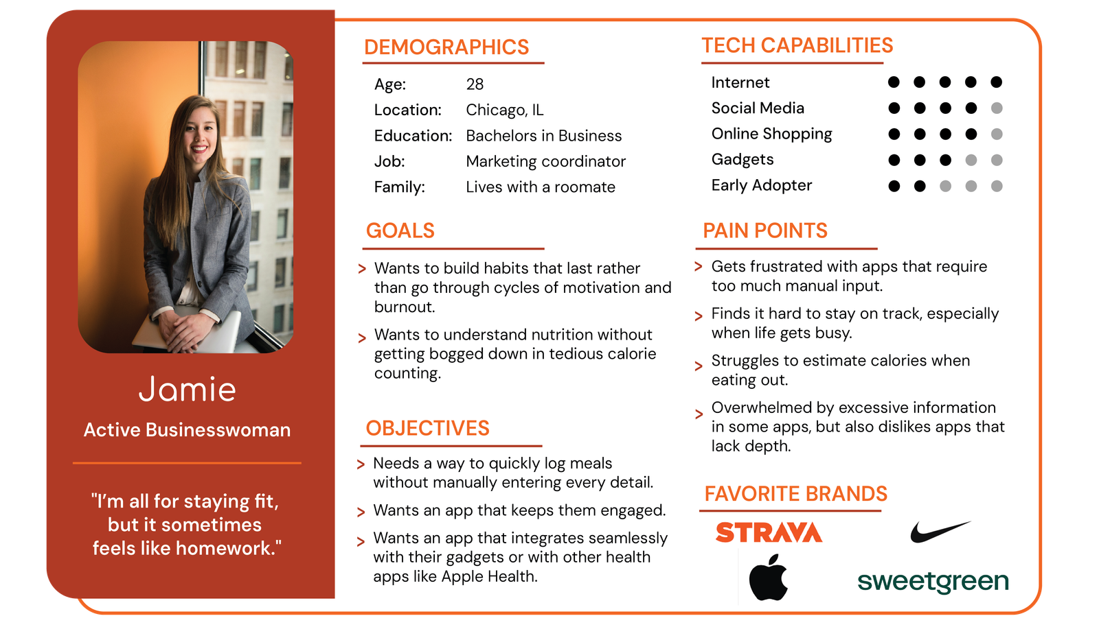
User Research & Persona
Following the competitive analysis, I conducted user interviews with individuals who had experience using fitness or calorie-tracking apps. By analyzing their feedback, I identified common pain points and goals, which I then combined into a single representative user persona.
Phase 2: Define & Ideate
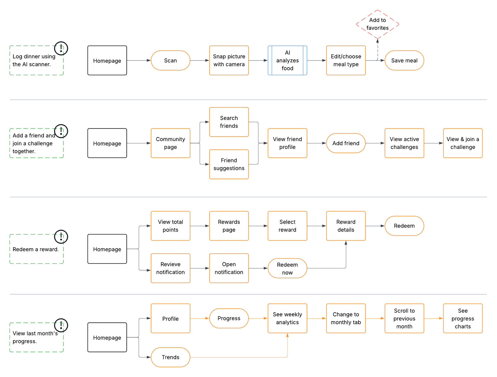
User Task Flows
Based on the user persona and key goals, I developed task flows to map out how users would navigate the app to complete core actions efficiently and intuitively.
Phase 3: Branding & Visual Identity
Typographic Exploration & Logotype Development
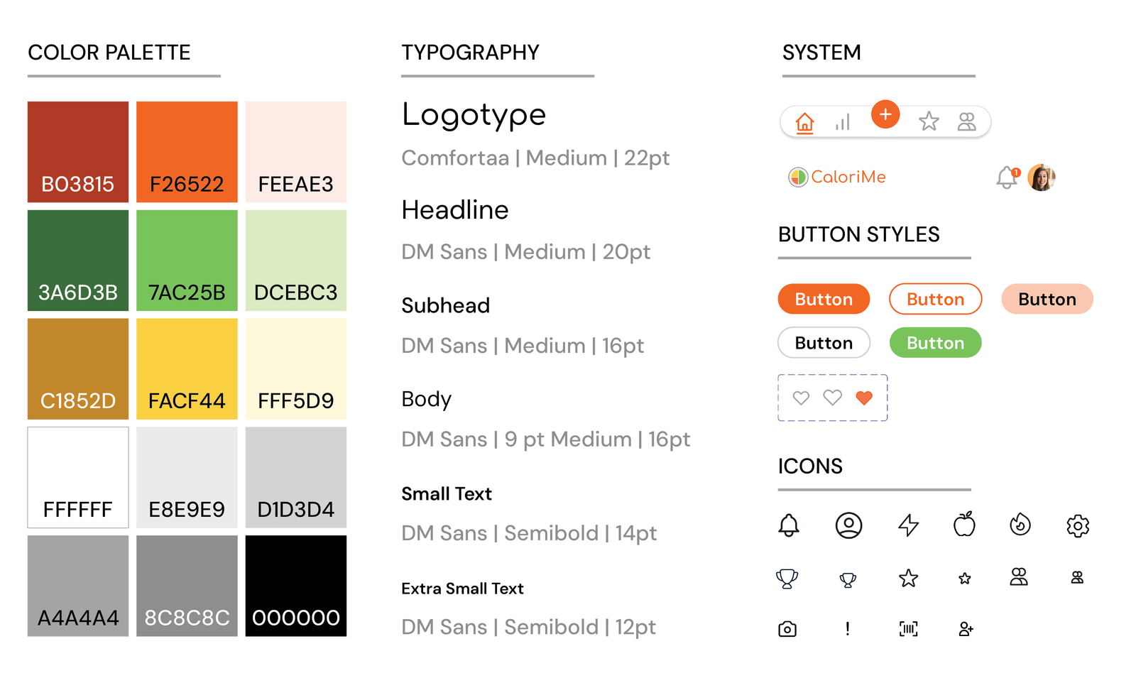
The branding process for CaloriMe began with sketching potential logos and typeface exploration. Through experimentation, these initial concepts were refined into clean vector graphics that established the foundation for the app's visual identity. After exploring and refining a range of digital concepts—including logos, icons, and color palettes—I finalized a design that reflects the core values of the app. The selected color palette and typography were intentionally chosen to evoke a sense of energy, wellness, and simplicity, aligning with CaloriMe’s goal of making healthy habits both accessible and motivating.
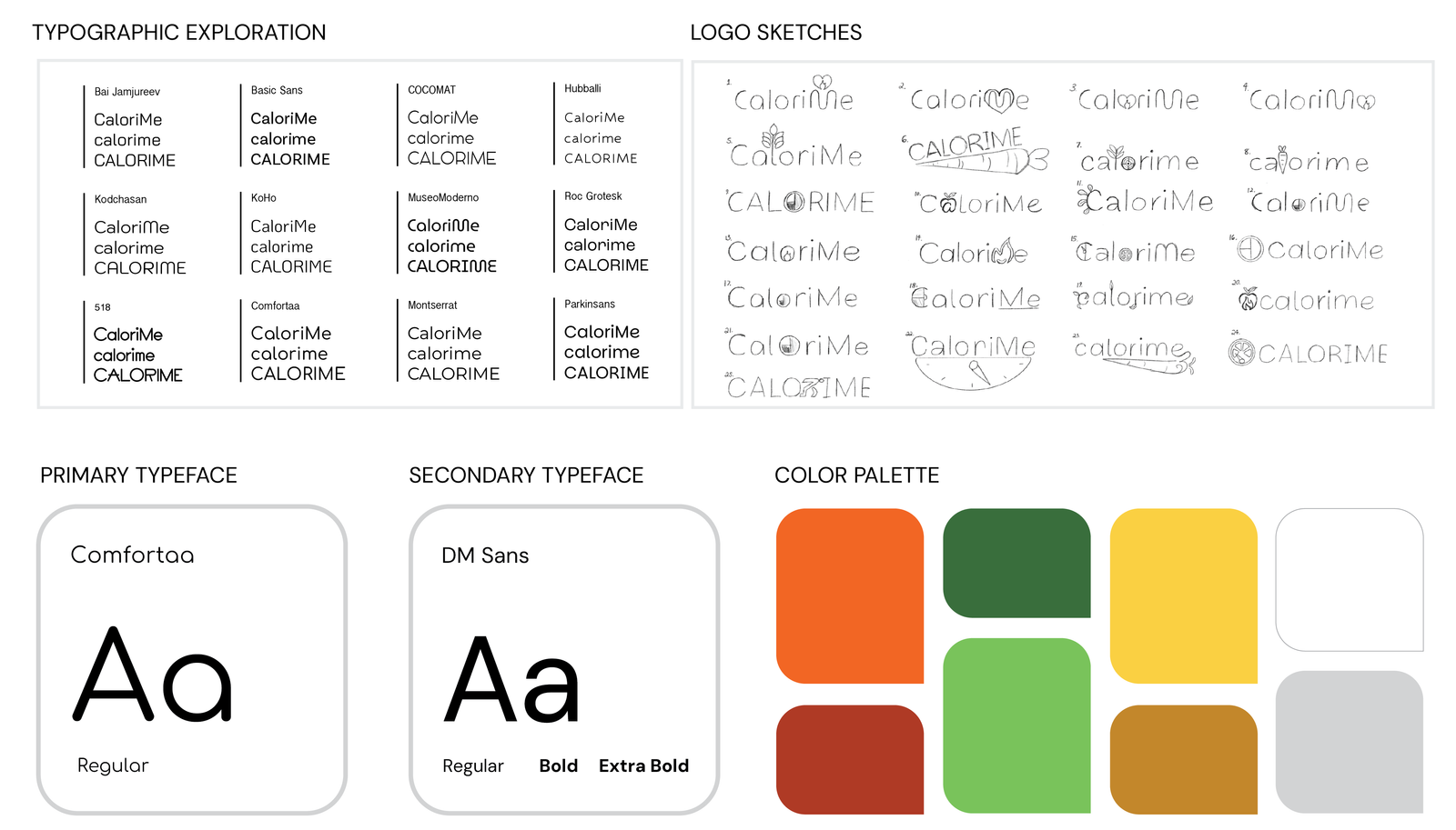
Final Brand Identity
The final logo and app icon feature a circular design divided into four colored quadrants, representing balanced nutrition with visual elements of different food groups. The warm, energetic color palette combined with friendly typography creates an approachable yet professional brand identity that resonates with health-conscious users.
Phase 4: Wireframing & Prototyping
Low-Fidelity Wireframe Sketches
With the task flows in place, the next step was creating low-fidelity wireframe sketches to visualize the app's layout and structure, focusing on functionality and user flow before refining visual details.
I created hand-drawn sketches for all major task flows:
- Meal logging with AI scanner: Home → Camera → Analysis/Edit → Home (with added meal)
- Adding friends and joining challenges: Home → Friends/Challenges → Friend Profile → Challenge
- Viewing progress analytics: Home → Profile → Progress (weekly/monthly views)
- Redeeming rewards: Home → Notifications → Rewards → Reward Details

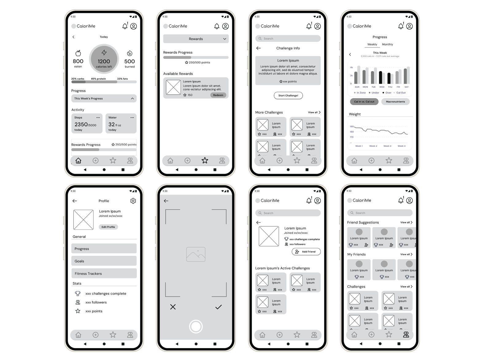
Digital Wireframes
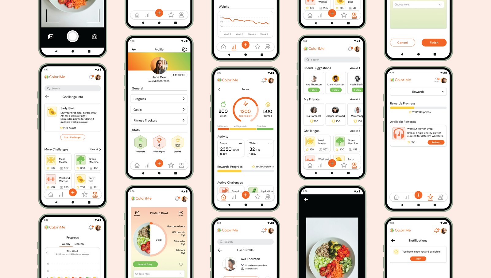
Next, I translated my low-fidelity sketches into digital wireframes using Figma. I designed 13 screens in total, with 8 key screens showcased. Using a grayscale approach helped keep the emphasis on layout, hierarchy, and user flow—allowing functionality to take center stage without the distraction of color or detailed visuals.
I aimed to preserve a minimalist aesthetic throughout the wireframes to reflect the app's overall design goals of simplicity and ease of use.
Key Wireframe Screens
DESIGN PRINCIPLE
The wireframes prioritized clean information hierarchy, intuitive navigation patterns, consistent component placement, and accessibility considerations—all essential for creating a user-friendly experience.
Phase 5: Visual Design & High-Fidelity Prototypes
Design System Development
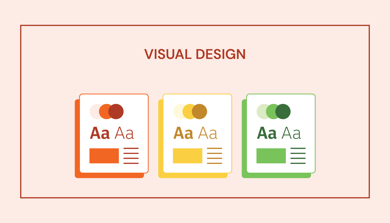
During the high-fidelity design phase, I refined the layout and visual elements based on both functionality and aesthetic goals. I began by building out a complete design system in Figma, including buttons, interactive charts, and UI components. From there, I layered color and typography over my low-fidelity wireframes, using the pre-made components to ensure consistency across screens.
Component Library
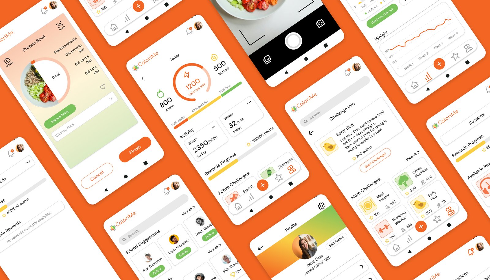
High-Fidelity Screens
Access the Figma mobile app prototype here
DESIGN CONSISTENCY
Throughout the high-fidelity design phase, I maintained clean white backgrounds with strategic color integration for visual interest. Consistent component usage across all screens created a cohesive, modern, and approachable aesthetic that aligns with CaloriMe's brand values.
Design Challenges & Solutions
Challenge 1: Color Balance
Problem: Most of the app uses white backgrounds for a clean, modern feel. It was
difficult to
integrate enough color to keep the interface visually engaging without overwhelming users.
Solution: I used colorful icons, selective accents, and color-coded visuals to
add energy where it mattered, balancing playful elements with white space to maintain a clean,
approachable interface.
Challenge 2: Simplicity vs. Depth
Problem: Users like Jamie want depth and detailed information but get
overwhelmed by too much information presented at once.
Solution: I applied progressive disclosure and clear visual hierarchy to
surface key information first, with expandable sections that let users explore deeper analytics
without overwhelming the interface.
Challenge 3: Engagement & Consistency
Problem: Users struggle to maintain tracking habits over time, leading to
abandoned apps and
failed fitness goals.
Solution: I combined gamification, social accountability, and visual progress
tracking to keep users motivated, while an AI-powered quick-log feature reduces friction and
supports long-term consistency.
Responsive Design Extension
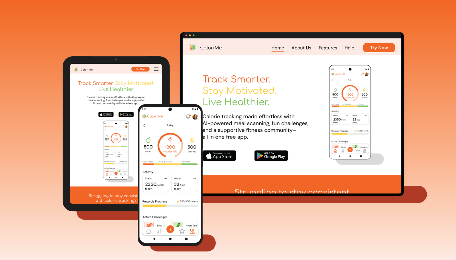
In addition to the mobile app, I designed a responsive landing page for desktop and tablet devices. The landing page serves as a marketing tool to attract new users and clearly communicate CaloriMe's value proposition.
Impact & Results
User-Centered Solution
- Addresses real pain points identified in user research
- Balances simplicity with engaging features
- More intuitive than competitors (who average 3/5 stars)
- No paywall for essential features
- Designed specifically for users like Jamie who want depth without overwhelm
Market Differentiation
- AI-powered scanning: More reliable than traditional barcode scanners
- Strong gamification: Challenges and rewards keep users engaged
- Community features: Social accountability and support
- Polished aesthetic: Modern, clean design that stands out
POTENTIAL IMPACT
CaloriMe has the potential to help users build lasting healthy habits by reducing friction in calorie tracking, increasing consistency through motivation and gamification, and creating a supportive fitness community. By addressing the key pain points that cause users to abandon other fitness apps, CaloriMe can make a meaningful difference in users' health journeys.
Key Takeaways & Skills Developed
What I Learned
- Competitive analysis is crucial: Understanding market gaps informed the unique feature set and helped identify opportunities for differentiation
- User research drives design: Jamie's pain points directly shaped core features like the AI scanner and gamification elements
- Task flows prevent confusion: Mapping user journeys early ensured intuitive navigation and logical information architecture
- Design systems save time: Building components first enabled consistent, efficient design across all screens
- Color requires strategy: Balancing clean aesthetics with visual interest takes intentional planning and iteration
- Iteration is essential: Moving from sketches → wireframes → high-fidelity allowed for refinement at each stage
Core UX Skills
- End-to-end product design (concept to high-fidelity)
- Comprehensive branding and visual identity development
- Competitive analysis and market research
- User persona development and empathy mapping
- Task flow mapping and information architecture
- Design system creation and component libraries
- High-fidelity prototyping in Figma
- Responsive web design principles
- Strategic color theory and typography