Google UX Design Specialization
Through three hands-on UX projects, this certification sparked my interest in UI/UX design while building a foundation in research, accessibility, and responsive design.
My Learning Journey
Throughout the Google UX Design Specialization, I developed a comprehensive understanding of the UX design process from initial research to final prototypes. Each project built upon the previous one, allowing me to refine my skills and deepen my understanding of user-centered design principles.
Starting with Fulla Beans Cafe, I learned the fundamentals of user research, empathy building, and the critical importance of accessibility in design. This project taught me that designing for users with disabilities and diverse needs isn't an afterthought—it's essential from the very beginning.
With UniNet Connect, I expanded into responsive web design and tackled complex information architecture. I learned that the first design isn't always the best solution, and that iteration based on user feedback is key to creating intuitive experiences across multiple device types.
Finally, Medify brought everything together. This project challenged my initial assumptions and reinforced that users often need more robust solutions than we initially imagine. I learned that conducting usability studies at every stage of development dramatically increases the chances of creating a successful product.
KEY INSIGHT
The most valuable lesson across all three projects was learning to practice empathy with users through personas, user journeys, and continuous feedback. Both positive and negative feedback consistently improved my designs and made them more user-focused.
Project 1: Fulla Beans Cafe Ordering App
My first dive into UX design fundamentals
The Challenge
- Busy workers and commuters lack the time to visit sit-down cafes or wait in long lines
- Customers with disabilities, language barriers, or social anxiety are deterred from local shops due to lack of accommodations
- Existing cafe apps don't prioritize accessibility options for diverse users
My Approach & Key Learnings
I began by conducting user interviews to build empathy and understand the real needs of cafe customers. This research revealed two primary user groups: busy professionals who value their time, and individuals who face barriers to in-person ordering.
I created two personas—Emma, a busy nursing student who needs to maximize her break time, and Alex, a software engineer with social anxiety and a visual impairment who needs a stress-free ordering experience. These personas guided every design decision throughout the project.
Through two rounds of usability testing (low-fidelity and high-fidelity), I learned that:
- Buttons need sufficient contrast and size to stand out
- Negative space is crucial for readability and reducing cognitive load
- Users want detailed information (prices, descriptions, images) when ordering
- Accessibility settings should be easily accessible from every page
Design Highlights
- Accessibility-first approach: Quick access button to accessibility settings on most pages
- Visual clarity: Imagery provided for each drink with detailed descriptions
- Customization options: Adjustable text size for users with visual impairments
- Intuitive navigation: Simple navigation bar focused on easy, uncomplicated use
- Order flexibility: Users can order ahead for pickup or from their table seat
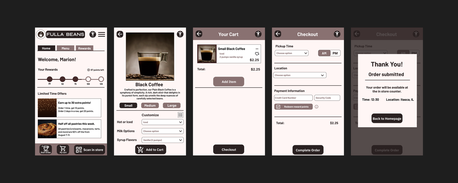
Impact
The Fulla Beans Cafe app helps customers feel included and provides a way to order quickly while skipping lines. The design accommodates users with disabilities, anxiety, and time constraints.
Project 2: UniNet Connect - University Networking Site
Expanding into responsive web design
The Challenge
- University students struggle to balance academics, social life, and career development
- Existing networking platforms (like Handshake and LinkedIn) are confusing and don't meet student-specific needs
- Students prefer peer-to-peer help over formal tutoring but lack a platform to connect
- Current university networking apps are difficult to navigate
My Approach & Key Learnings
I interviewed 5 university students (aged 19-23) using a Google Form to understand their challenges with social life, academics, and career development. All participants expressed that they hadn't found a networking app that catered to their specific needs.
I conducted a competitive audit of Handshake (indirect competitor) and LinkedIn Learning (direct competitor) to identify gaps in the market. This revealed opportunities to create an "all-in-one" website that combines networking, academics, and career development—something neither competitor offered.
This project introduced me to responsive web design. I created wireframes and mockups for desktop, tablet, and mobile versions, learning how to adapt complex information architecture across different screen sizes while maintaining usability.
The usability study revealed critical insights:
- The Resources page layout was too cluttered and needed visual appeal
- The "Upcoming Events" label misled users—it needed clearer labeling
- Users expected a "back" button for intuitive navigation
Design Highlights
- Responsive layouts: Designed for desktop, tablet, and mobile devices with thoughtful information hierarchy
- Simplified navigation: Created a clear sitemap to organize complex features while keeping navigation simple
- Visual improvements: Transformed cluttered pages into visually appealing, scannable layouts
- All-in-one platform: Combined networking, academic resources, peer tutoring, and career development seminars
- Accessibility features: Settings page, high contrast colors, and screen reader compatibility
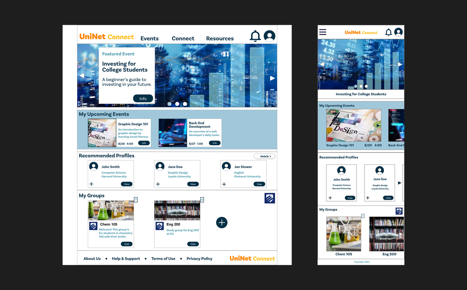
Impact
UniNet Connect addresses gaps in existing platforms by providing university students with a comprehensive tool to broaden their horizons professionally and socially. The platform helps shy students step out of their comfort zone and prepare for the real world through peer connections, study groups, and professional development resources.
Project 3: Medify - Medication Reminder App & Responsive Website
Bringing it all together by designing for social good
The Challenge
- Medication non-adherence poses significant health risks to users worldwide
- Need for an inclusive, easy-to-use tool that bridges generational gaps in medication management
- Existing solutions lack advanced customization and intuitive scheduling features
- Users of all ages and technology proficiency levels need to manage complex medication schedules
My Approach & Key Learnings
This project challenged my initial assumptions from the very beginning. I entered the research phase believing users primarily needed simple reminders with minimal customization. However, through interviews and usability testing with a diverse group of potential users, I discovered they desired a much more robust solution.
I created two personas: Sarah, a retiree who values independence and needs easy smartphone setup, and Alex, a busy software engineer managing a chronic condition who needs to balance work, family, and health commitments.
I conducted a competitive audit of Medisafe and MyChart, which helped identify opportunities to tailor the app to more users through accessibility features and create a seamless experience across multiple devices.
Through multiple rounds of usability testing, I learned that:
- Users had trouble editing reminders and intuitively finding pages
- The homepage calendar needed to be interactive, not just display-only
- Users wanted more customization options for medication reminders
- A medication history page was essential for tracking past medications
- Clear explanations were needed for features like tracking and schedule sharing
Design Highlights
- Comprehensive medication management: Daily reminders, weekly schedules, and medication history tracking
- Advanced customization: Visual and intuitive options for editing reminders based on user feedback
- Interactive calendar: Redesigned weekly schedule page with interactive elements
- Responsive design: Seamless experience across mobile, tablet, and desktop devices
- Accessibility settings: Dedicated page for users with disabilities or visual impairments
- Clear navigation: Simple navigation bar focused on easy, uncomplicated use for all age groups
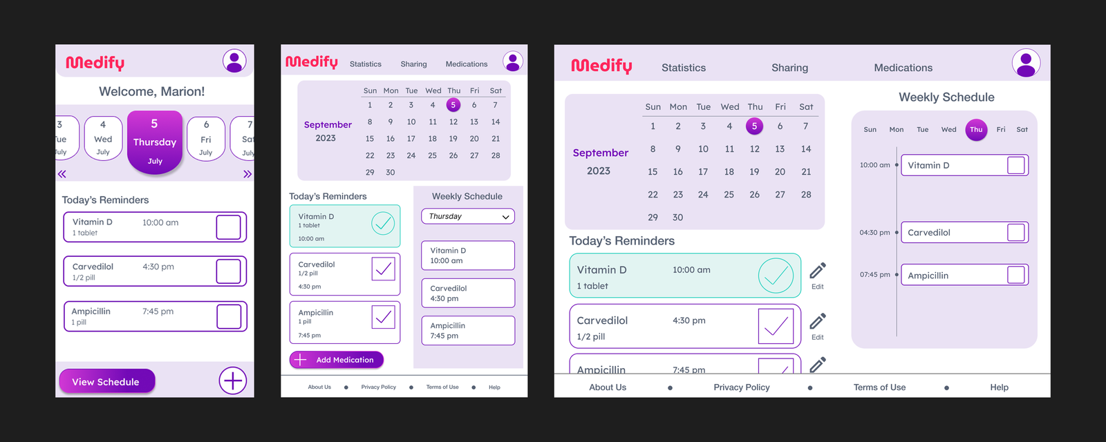
Impact
During usability studies, all participants expressed a desire for the Medify app to come to market. The app has the potential to deliver a positive societal impact by aiding a diverse range of individuals spanning all age groups in managing their medication schedules effectively and safely.
Medify addresses the critical issue of medication non-adherence by focusing on user-centricity and inclusivity, ultimately contributing to the overall well-being of individuals managing complex health needs.
Key Takeaways & Skills Developed
What I Learned
- The power of iteration: User feedback consistently improves designs and makes them more user-focused
- Accessibility first: Designing for users with disabilities should be considered from the start, not added later
- Challenge assumptions: Initial assumptions often shift through research—users may need more robust solutions than anticipated
- Test early and often: Usability studies at every stage increase chances of success
- Empathy is essential: Personas and user journeys are critical for starting any UX project
- First design isn't final: The first design may not be the best solution—iteration is key
- Responsive thinking: Designing for multiple devices requires thoughtful information architecture